Making a product difference impossible to miss.
Abbott’s Bakery - Smooth Oat Product Launch Campaign
Launching a new loaf into a crowded bread aisle meant giving people a reason to notice something genuinely different.
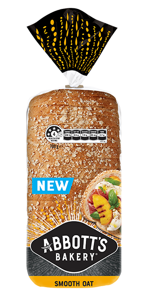
Smooth Oat offered the goodness of oats without the dense, coarse texture people often associate with healthier wholegrain breads. The opportunity was to turn that product difference into something people could instantly see and feel.
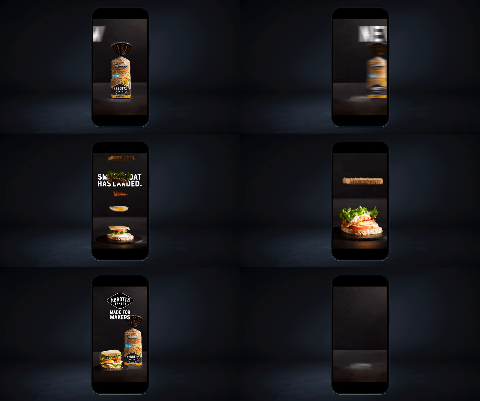
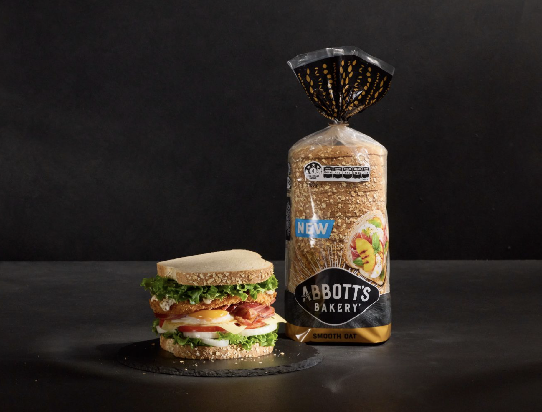
That product truth became Smooth Moves — a playful creative idea using slow motion to make smoothness visible. Ingredients floated, fell and landed with unexpected ease, creating a distinctive visual world that brought the product benefit to life without over-explaining it.
I worked across concept development, storyboarding, art direction and production to bring the idea to life, from choreographing the movement and composition of the food to creating a bold visual language designed to stand out in social.
A simple product difference turned into something you couldn’t scroll past..
-
The idea started with a simple tension: people might want the goodness of oats, but not the dense or coarse texture they often associate with healthier wholegrain breads.
Smooth Oat offered a way around that compromise.
Rather than simply telling people it was smooth, we looked for a way to make them feel the difference.
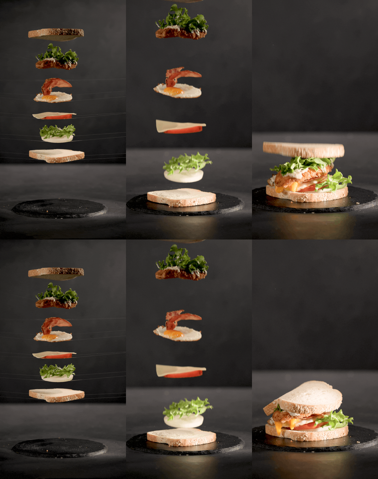
Playing on Smooth Moves, slow motion became a visual expression of the product itself. Ingredients floated, fell and landed with unexpected ease, turning smoothness from a product claim into something people could actually see.
The product difference became the creative idea.
-
What looked beautifully simple on screen took precision, patience and plenty of trial and error behind the camera.
Ingredients were physically suspended above the set and released at exactly the right moment, with take after take used to perfect their trajectory, rotation and landing in slow motion.
I worked closely across food styling, photography and production to balance the unpredictability of real ingredients with carefully considered composition and appetite appeal. Every movement needed to feel spontaneous, while every final frame still needed to look beautifully art directed and unmistakably Abbott’s.
That tension between control and chance gave the work its tactile quality.
The harder we worked behind the camera, the more effortless it felt on screen.
-
A new product couldn’t arrive quietly — particularly in a fast-moving social feed.
So while the food moved slowly, the typography did the opposite.
Bold type, sharp transitions and direct product messaging deliberately interrupted the fluid imagery, creating a push and pull between smoothness and impact.
That contrast gave the campaign its energy: smooth enough to communicate the product difference, but bold enough to stop the scroll and announce something new.
Smooth in the product. Sharp in the delivery.
My Role
Senior Art Director
Creative Concept Development
Art Direction
Storyboarding
Shoot Art Direction
Motion Direction
Food Photography Direction
Food Styling Direction
Typography Direction
Social Content Design
Online Video
Campaign Rollout
-
Creative concept, art direction, campaign idea, food photography direction, motion/storyboarding direction and digital rollout.
-
Agency: BMF
Client: George Weston Foods
Photography: Cris Cordeiro
Editor: Nico Engelbrecht