Making Black Friday unmistakably clear.
Clear Skincare - Black Friday Retail Campaign
Black Friday is one of the noisiest moments in the retail calendar. Bigger discounts, louder messaging and more visual clutter, with every brand competing for the same attention.
For Clear Skincare, the opportunity was to create something distinctive without adding to the noise.
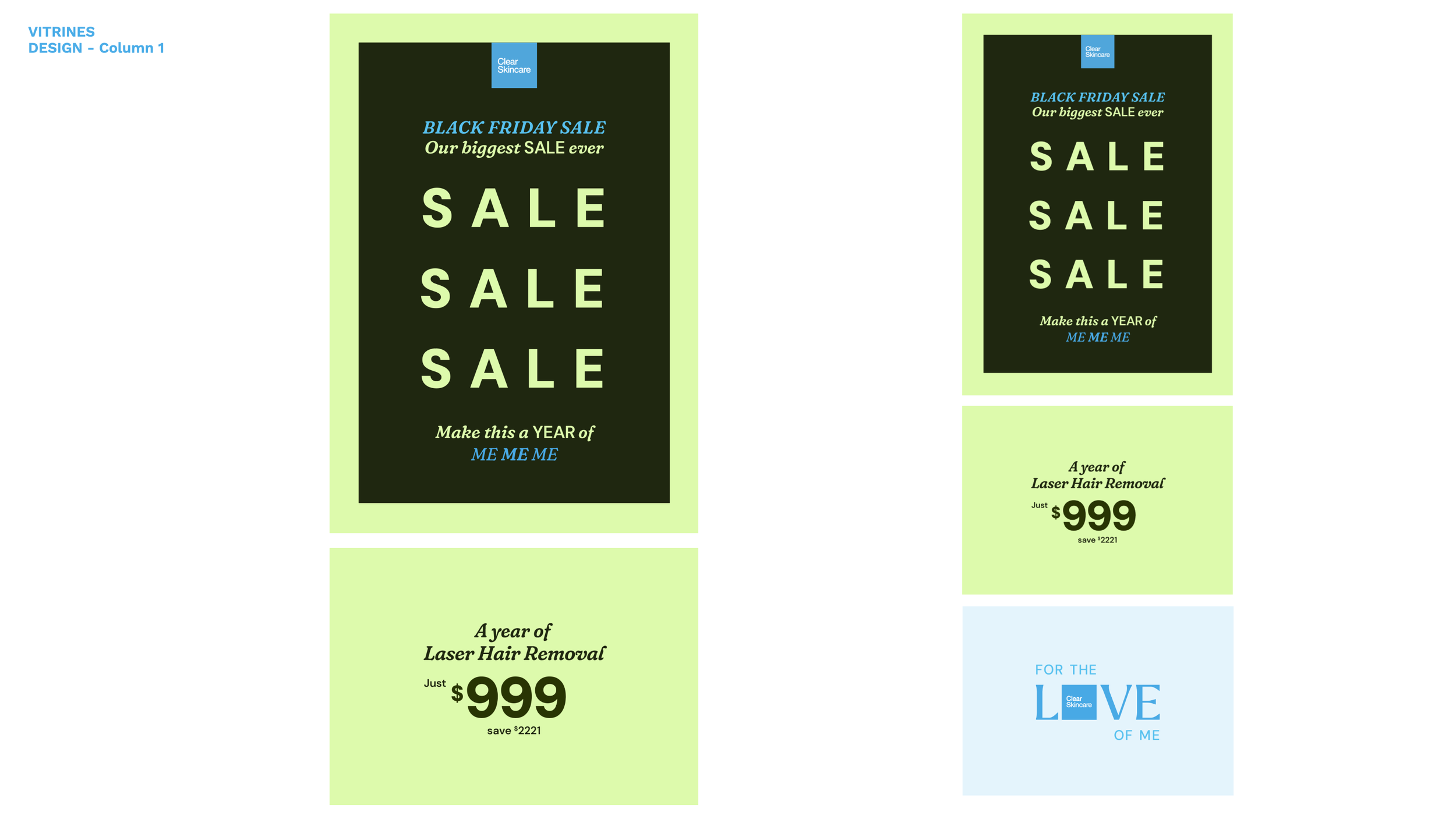
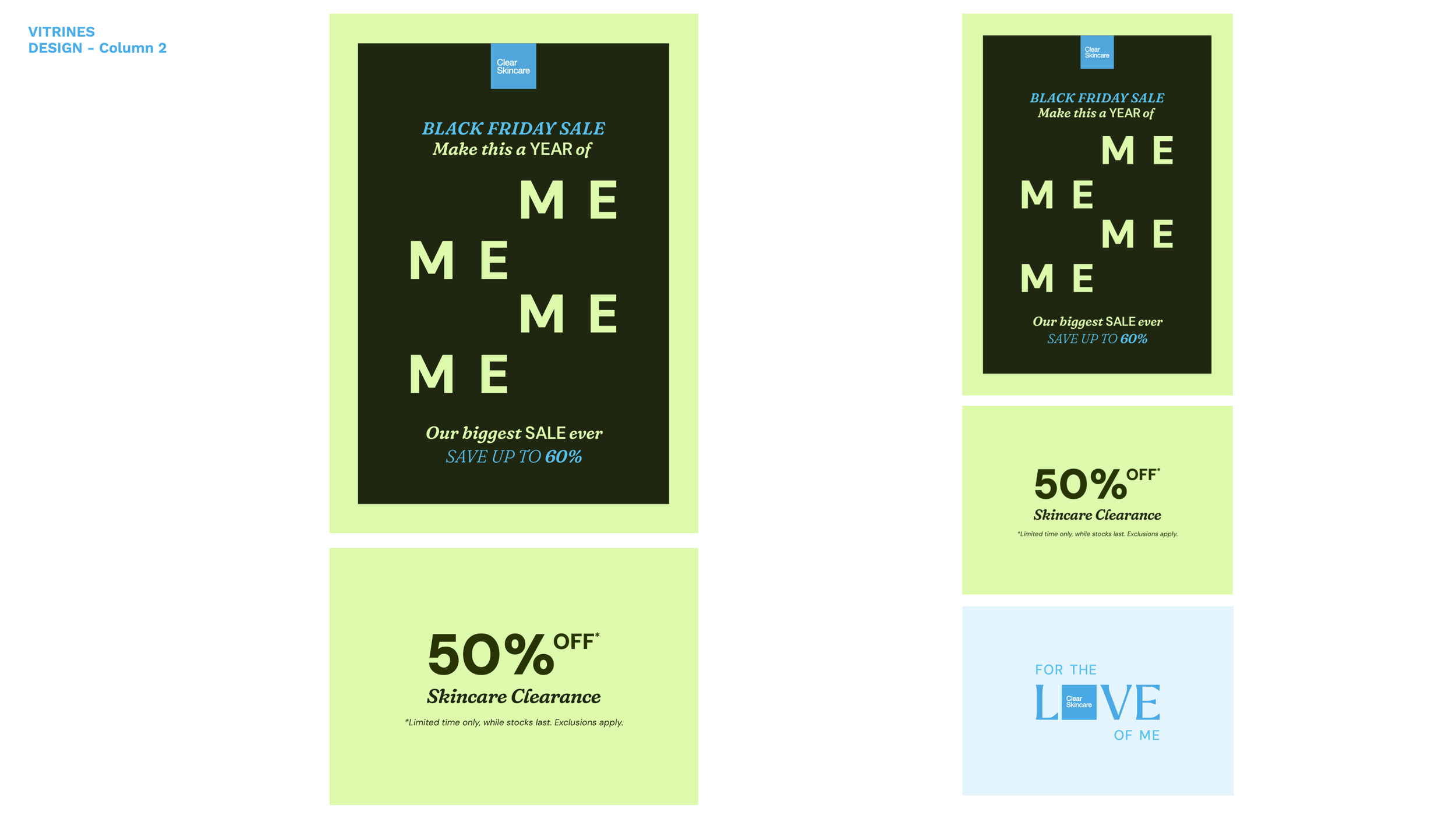
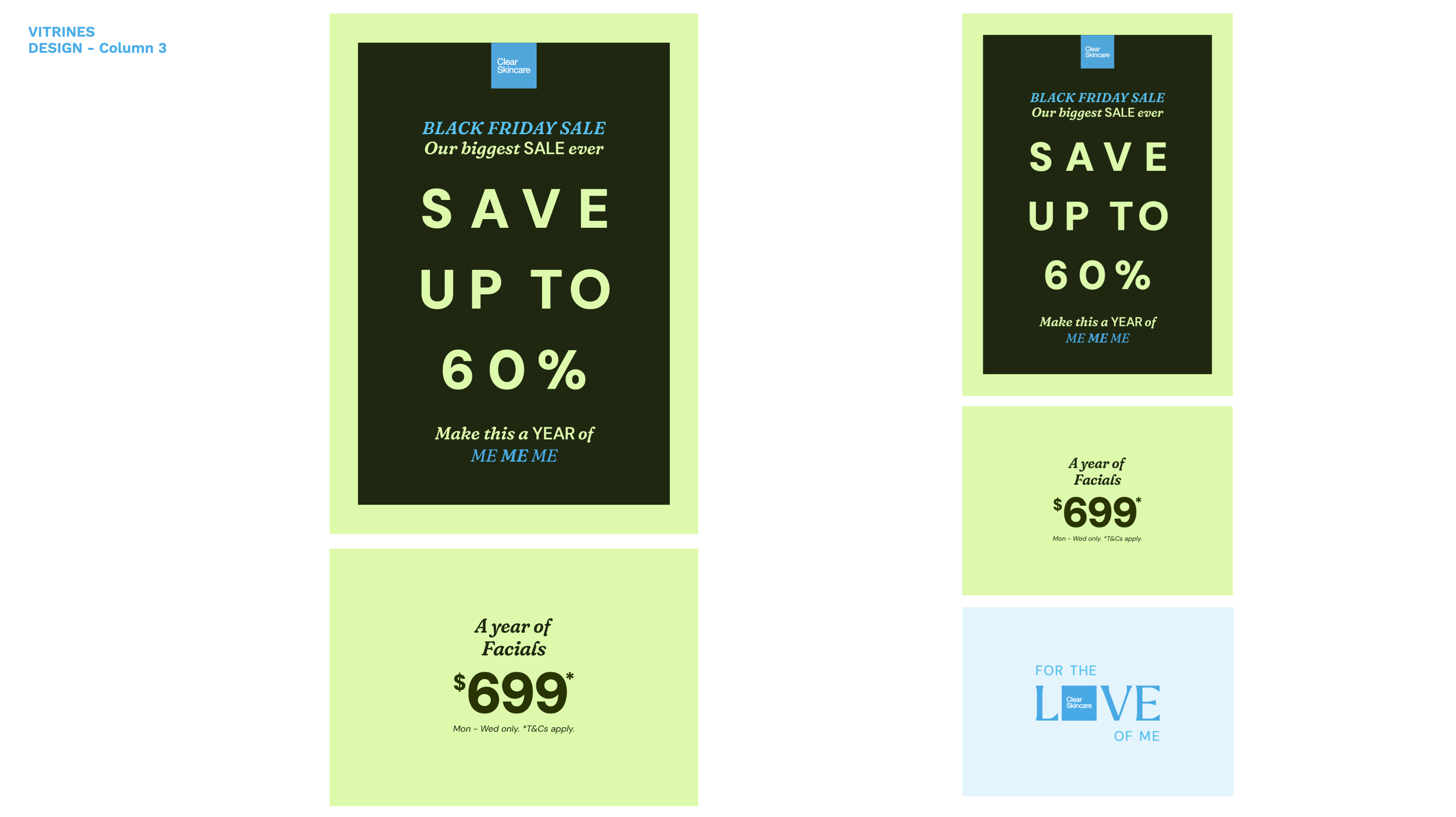
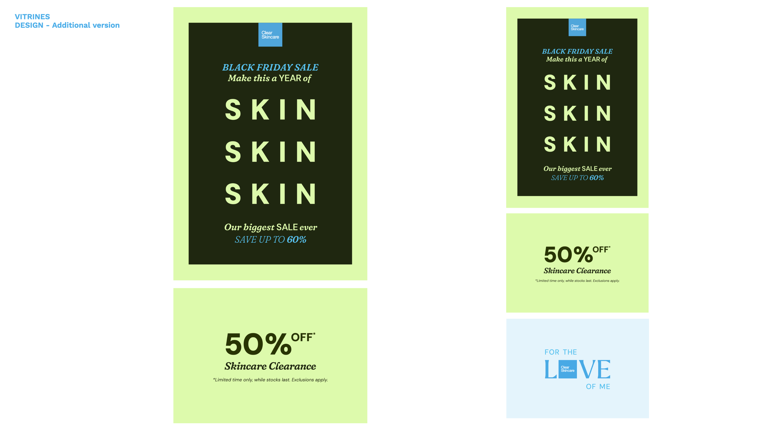
I developed a bold typographic campaign that stripped the message back and let the offer become the visual identity. Scale, repetition and movement transformed simple promotional messaging into a recognisable campaign language that felt confident, direct and unmistakably Clear.
The system was designed to flex across social, BVOD, digital out-of-home, print and in-clinic environments without losing its impact.
A simple idea that gave Clear its own voice in the busiest retail moment of the year.
-
Black Friday advertising has a habit of looking and sounding the same. Bigger discounts, more offers, more products and more competing messages.
Rather than adding another layer of noise, I took the opposite approach.
I stripped the creative back to its most important elements — the offer, the message and the Clear brand — and used simplicity as a way to create impact.
The result was a campaign that felt confident and immediately recognisable without relying on conventional product-led retail creative.
When everything is competing for attention, clarity becomes an advantage.
-
With product imagery stripped away, typography had to do much more than communicate the offer. It became the campaign.
I used scale, repetition, composition and movement to turn straightforward retail messaging into a distinctive visual language.
The simplicity gave every word more impact while creating enough flexibility to keep the campaign fresh across different messages and offers.
Rather than decorating the message, the design made the message itself the hero.
The message wasn’t added to the design. The message was the design.
-
The simplicity of the system meant it could move easily between very different environments without losing its identity.
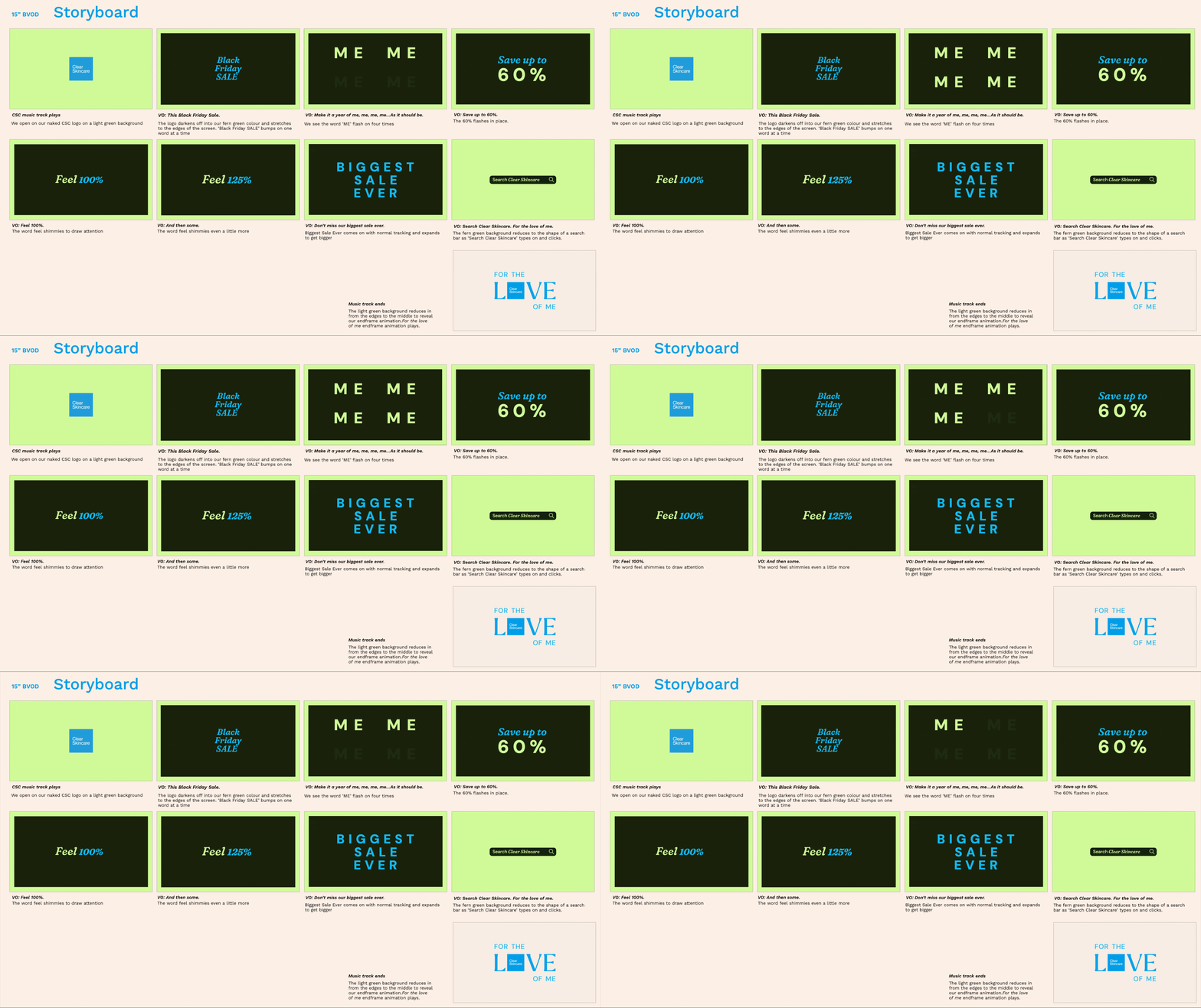
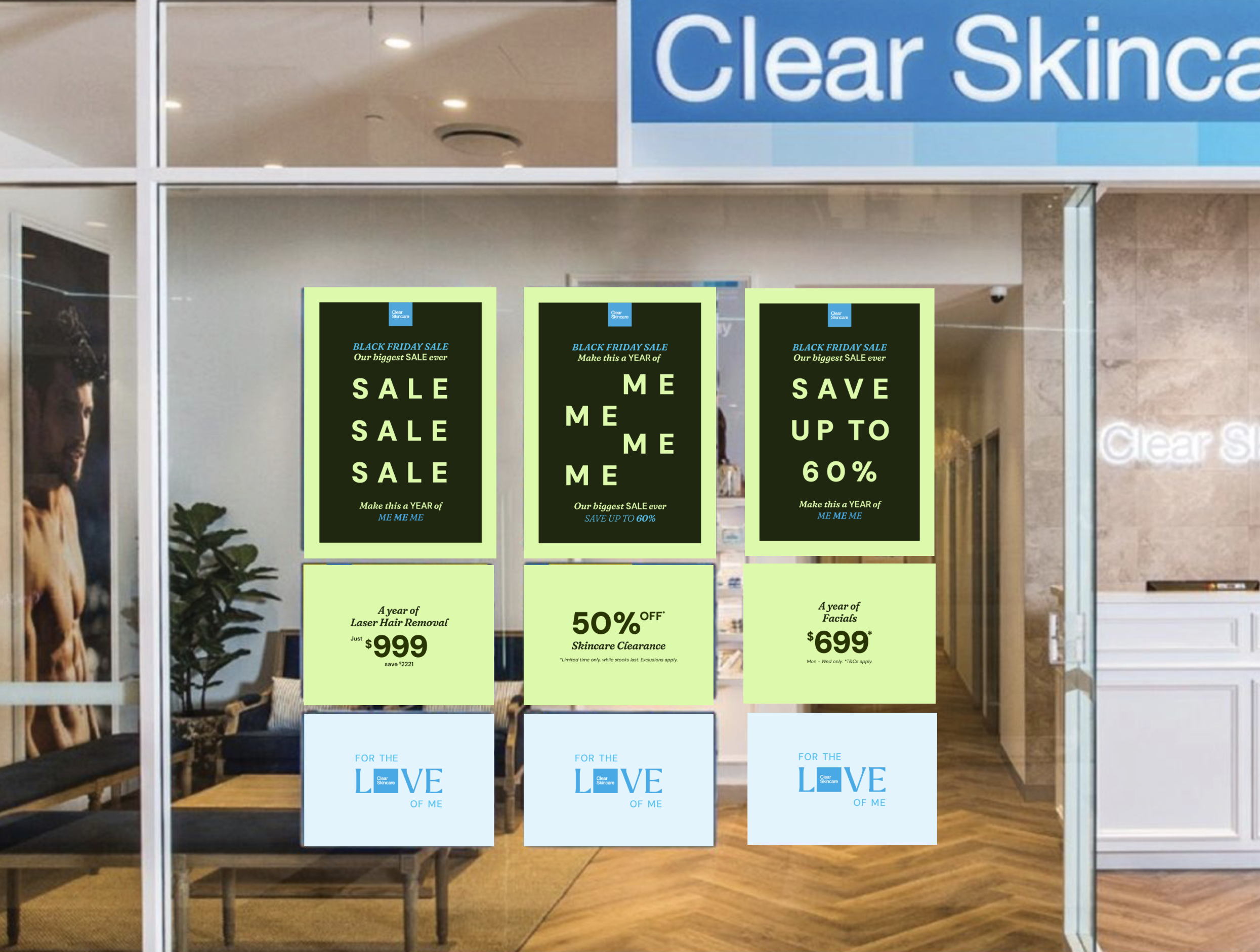
From social and digital display to BVOD, large-format digital out-of-home, print and in-clinic collateral, the same typographic language could expand, contract, move and adapt to suit the format.
That consistency gave Clear more than a collection of promotional executions. It created a recognisable Black Friday identity that held together wherever customers encountered it.
Different formats. One clear visual voice.
My Role
Senior Art Director
Creative Concept
Creative Direction & Art Direction
Campaign Identity
Typography
Motion Direction
BVOD Storyboarding
Digital OOH
Digital Display
Social Campaign
Print & In-Clinic
Campaign Rollout


-
Lead creative, campaign concept, art direction, typographic design system, motion direction and campaign rollout.
-
Agency: BMF
Client: Clear Skincare
Copywriter: Alister McCann