Making the invisible property market visible.
Open Doors - Off-Market Property UX/UI Experience
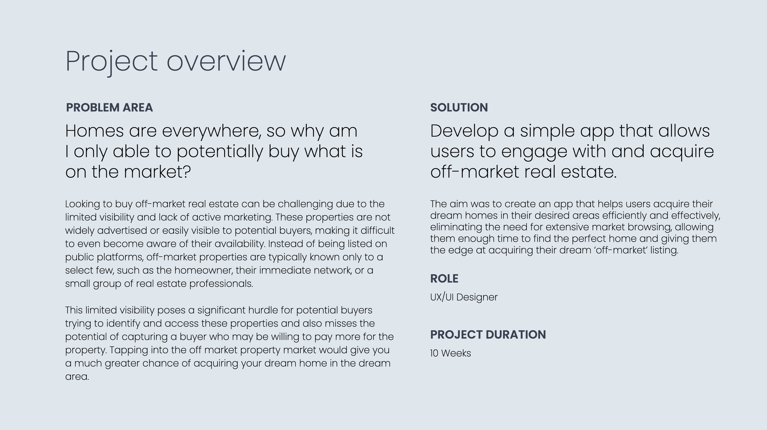
Finding the right home is often a waiting game. Buyers can only see what happens to be on the market, while homeowners who might consider selling remain invisible until they decide to list.
The opportunity was to explore what could happen before the traditional property search begins.
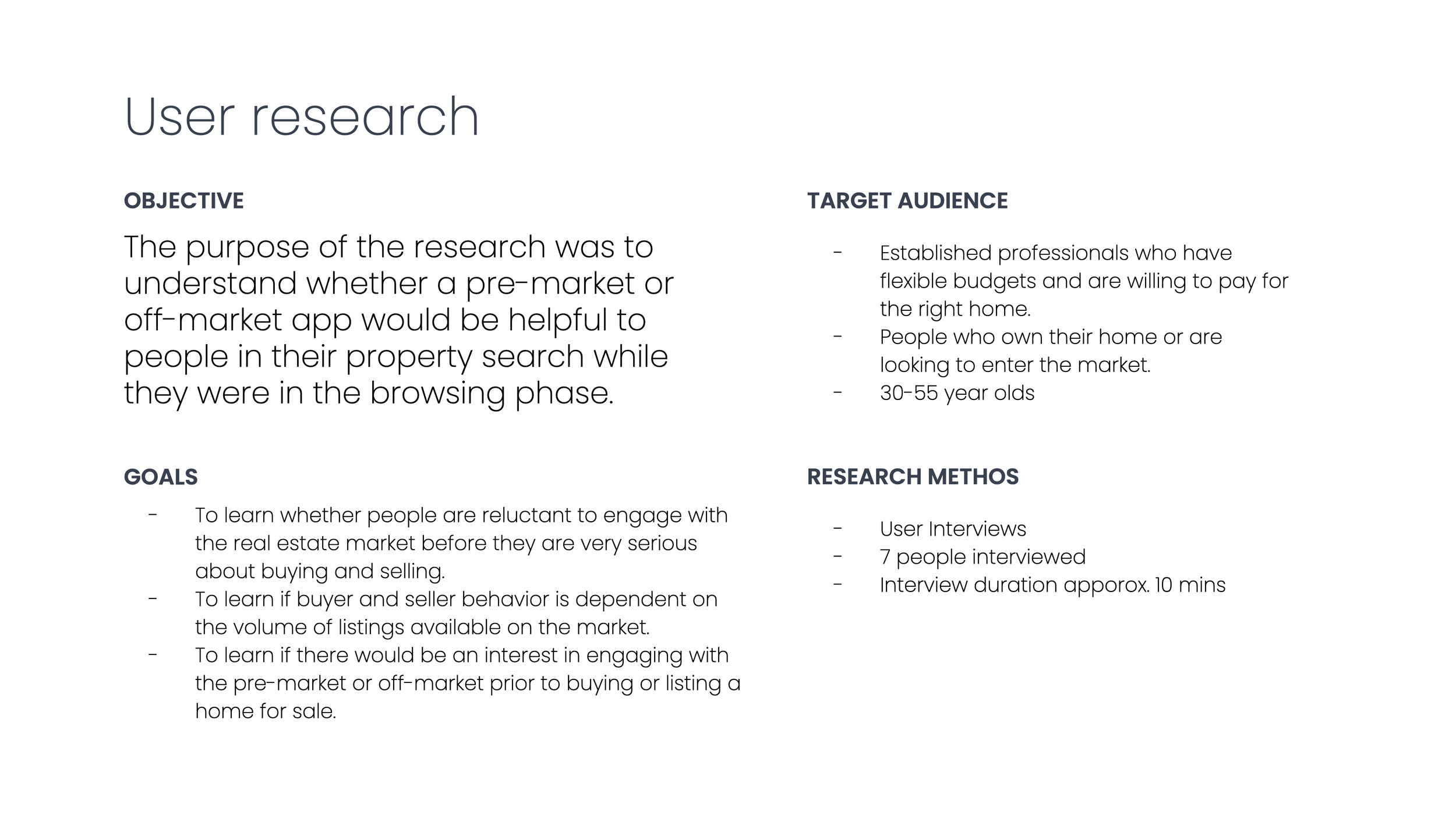
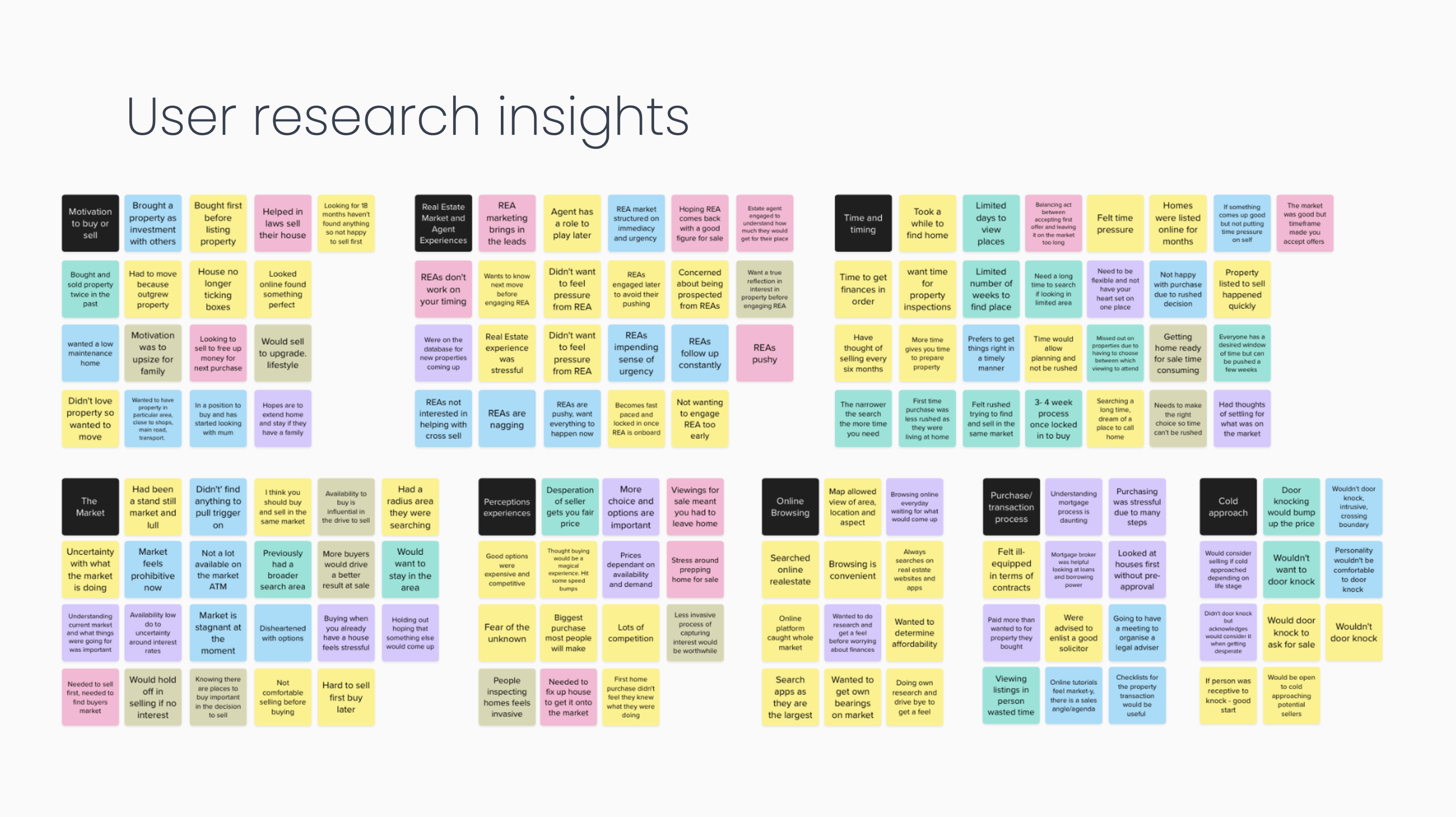
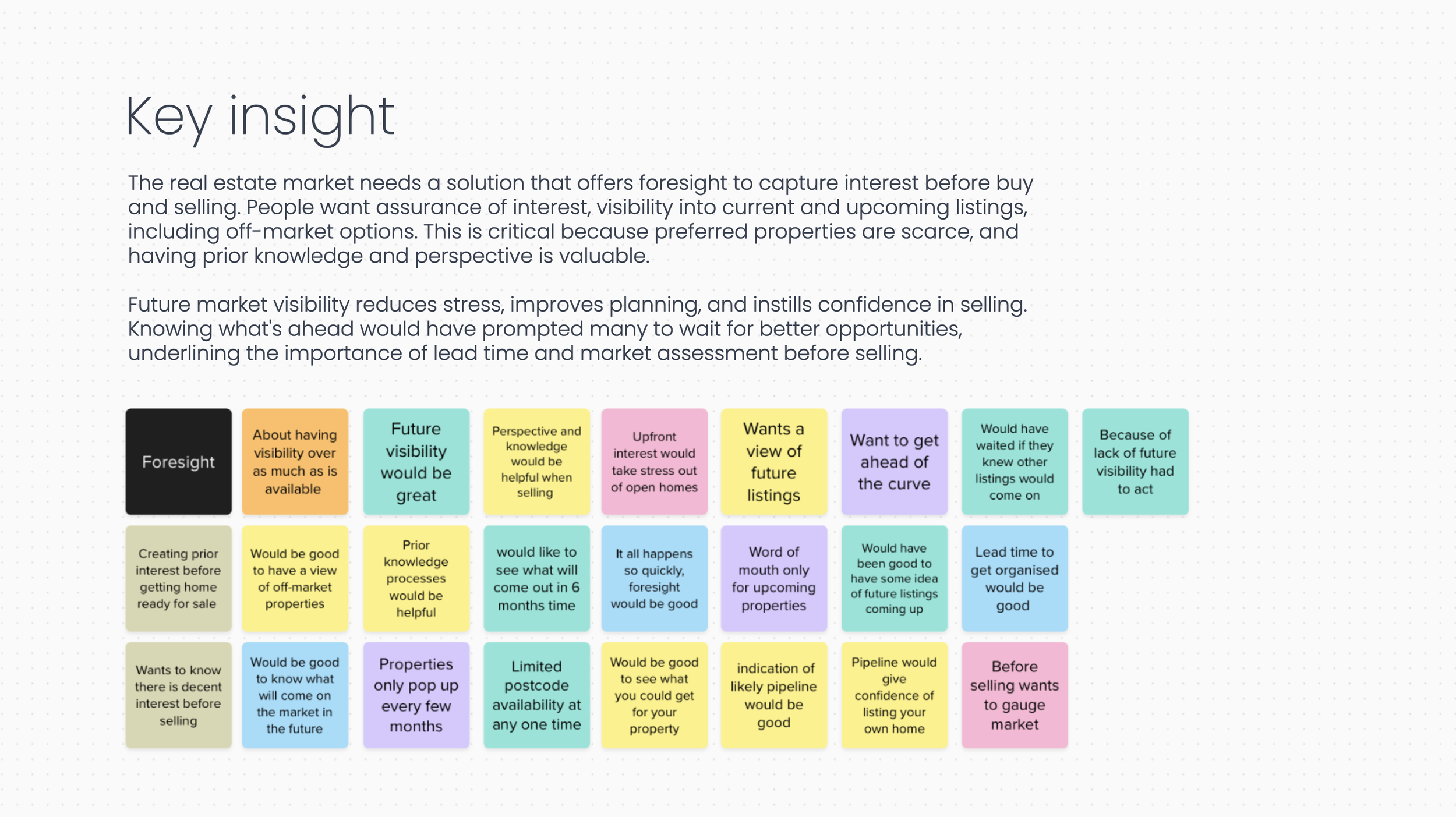
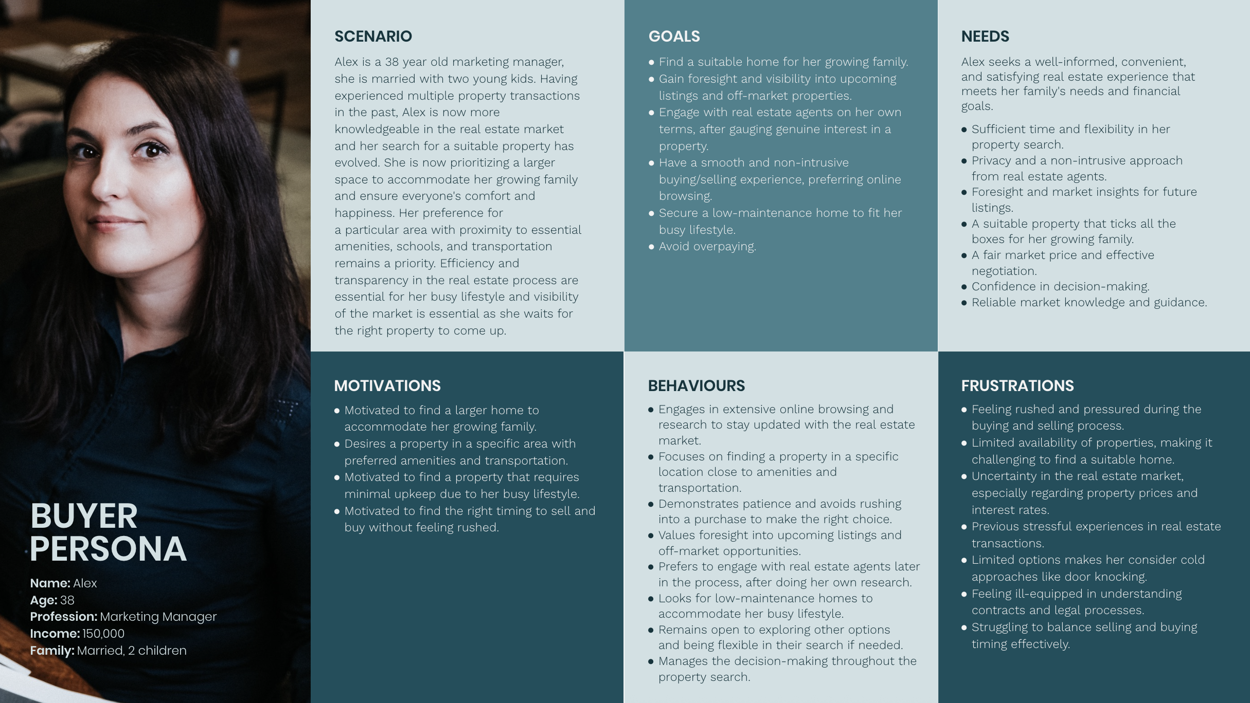
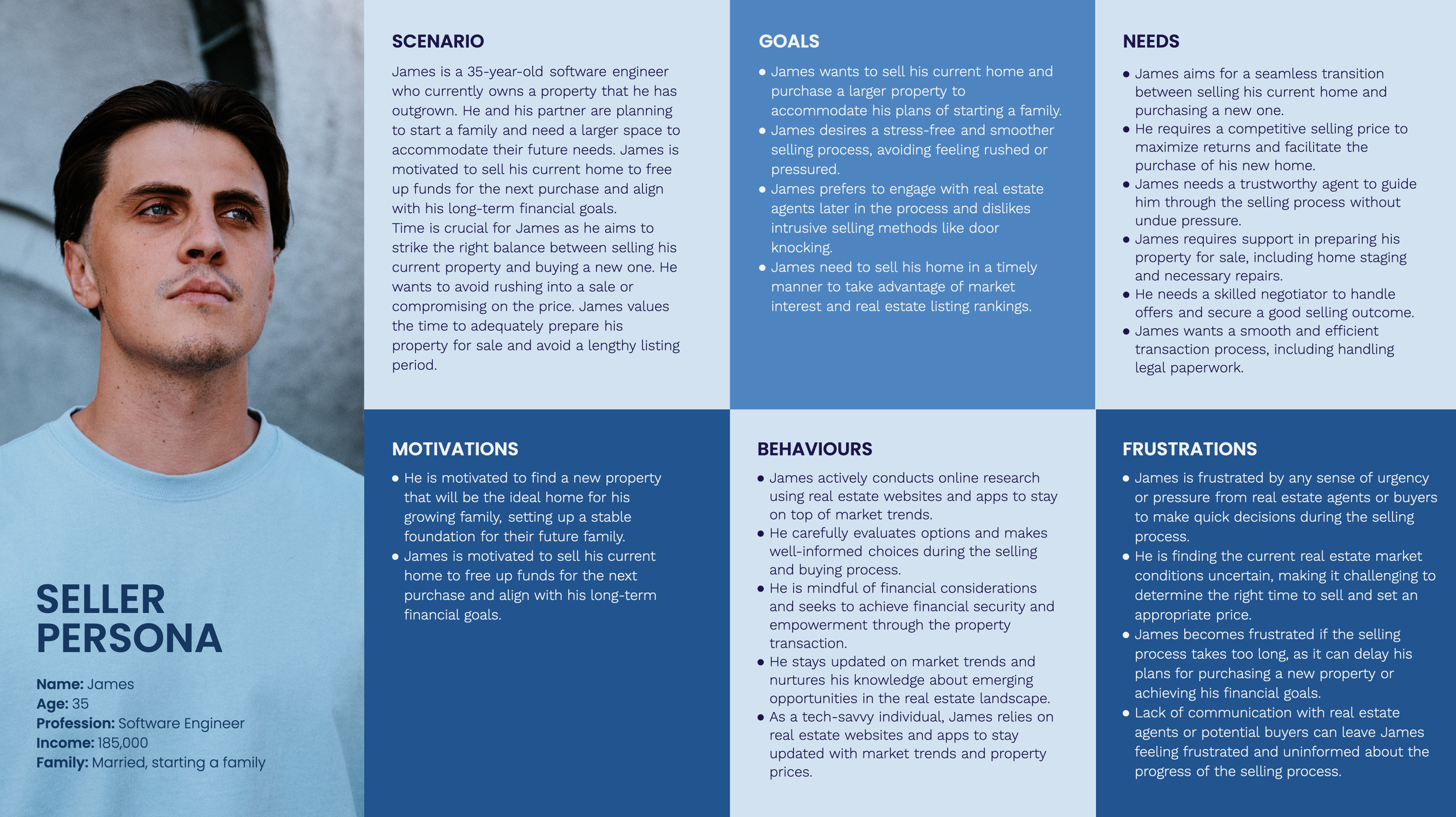
I started by speaking with potential buyers and sellers to understand how they behaved before they were ready to actively transact. A consistent need emerged on both sides: people wanted more foresight, more time and less pressure.
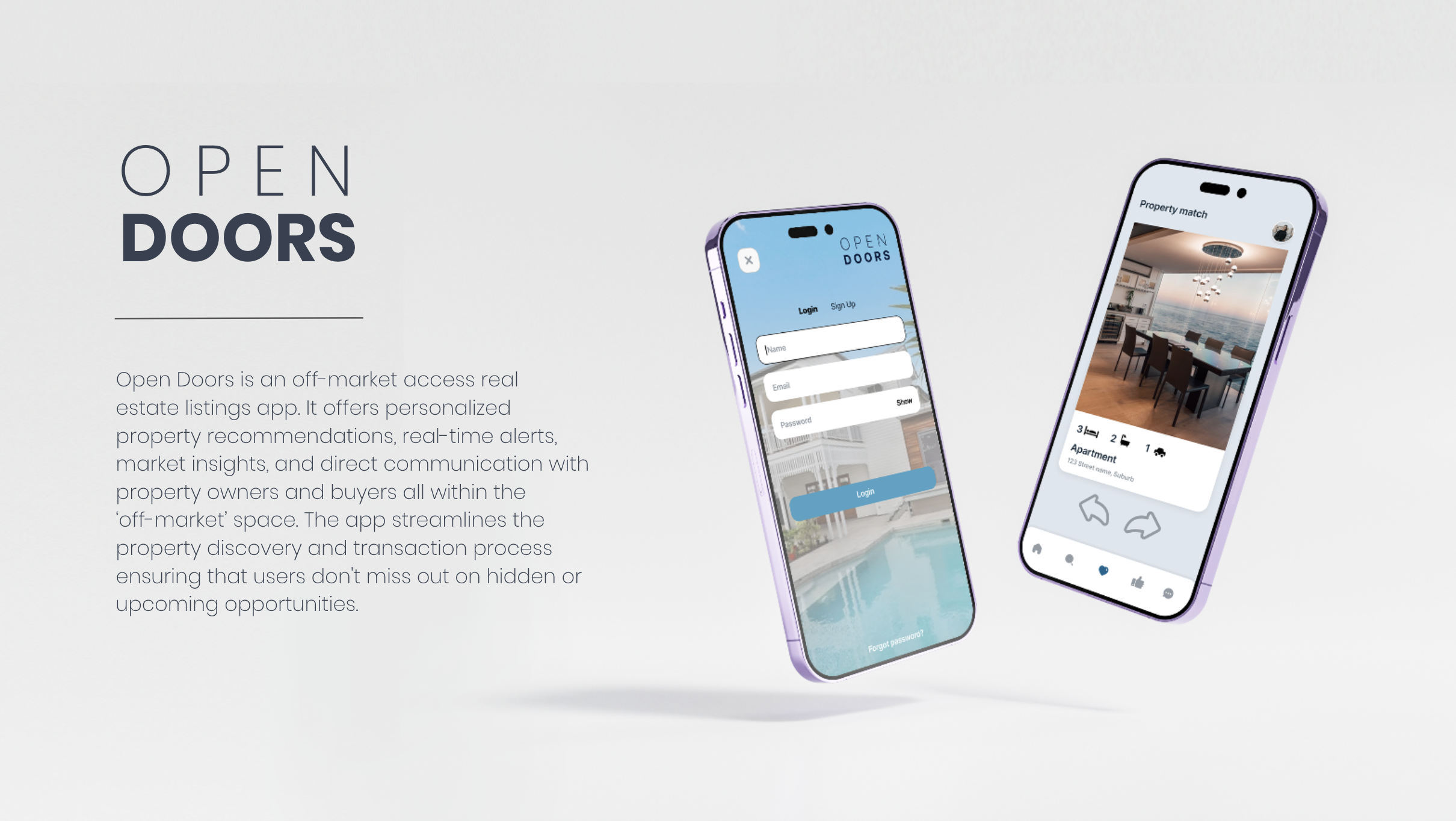
That insight shaped Open Doors — an off-market property experience designed to connect potential buyers and sellers earlier, giving buyers visibility of homes that might become available and sellers a way to understand genuine interest before committing to market.
I translated the research into the end-to-end experience, from journey mapping and feature prioritisation through to wireframes, user testing, visual design and an interactive prototype.
Instead of helping people search the existing market, Open Doors explored what could exist beyond it.
-
The project began with conversations with potential buyers and sellers to understand what happened before they were ready to actively transact.
A consistent theme emerged: both sides wanted more foresight.
Buyers wanted visibility of what might be coming rather than repeatedly waiting for the right property to appear. Sellers wanted greater confidence that genuine interest existed before committing to putting their home on the market.
Both wanted more time, more information and less pressure.
That shifted the opportunity from designing another property search experience to asking a different question: how could we connect buyers and sellers before the traditional listing process even began?
-
Once the opportunity was clear, the next challenge was deciding what the experience actually needed to do.
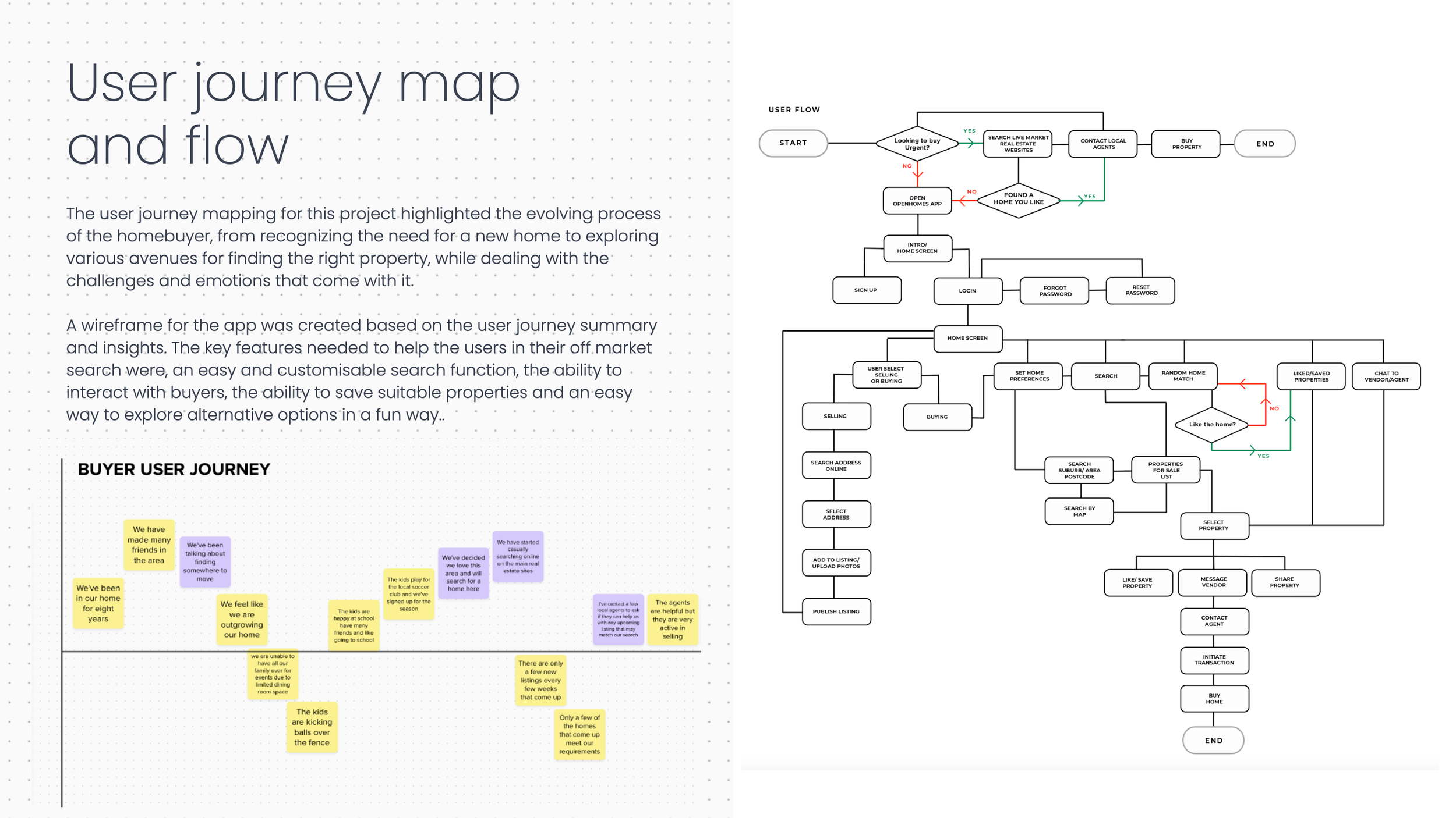
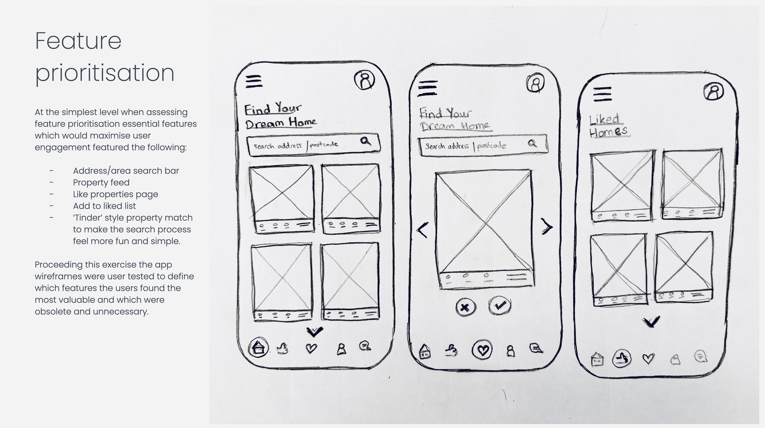
I mapped the buyer journey and translated the research into a focused set of features: personalised property discovery, an off-market feed, saved homes, direct buyer and seller messaging, and a simple matching interaction.
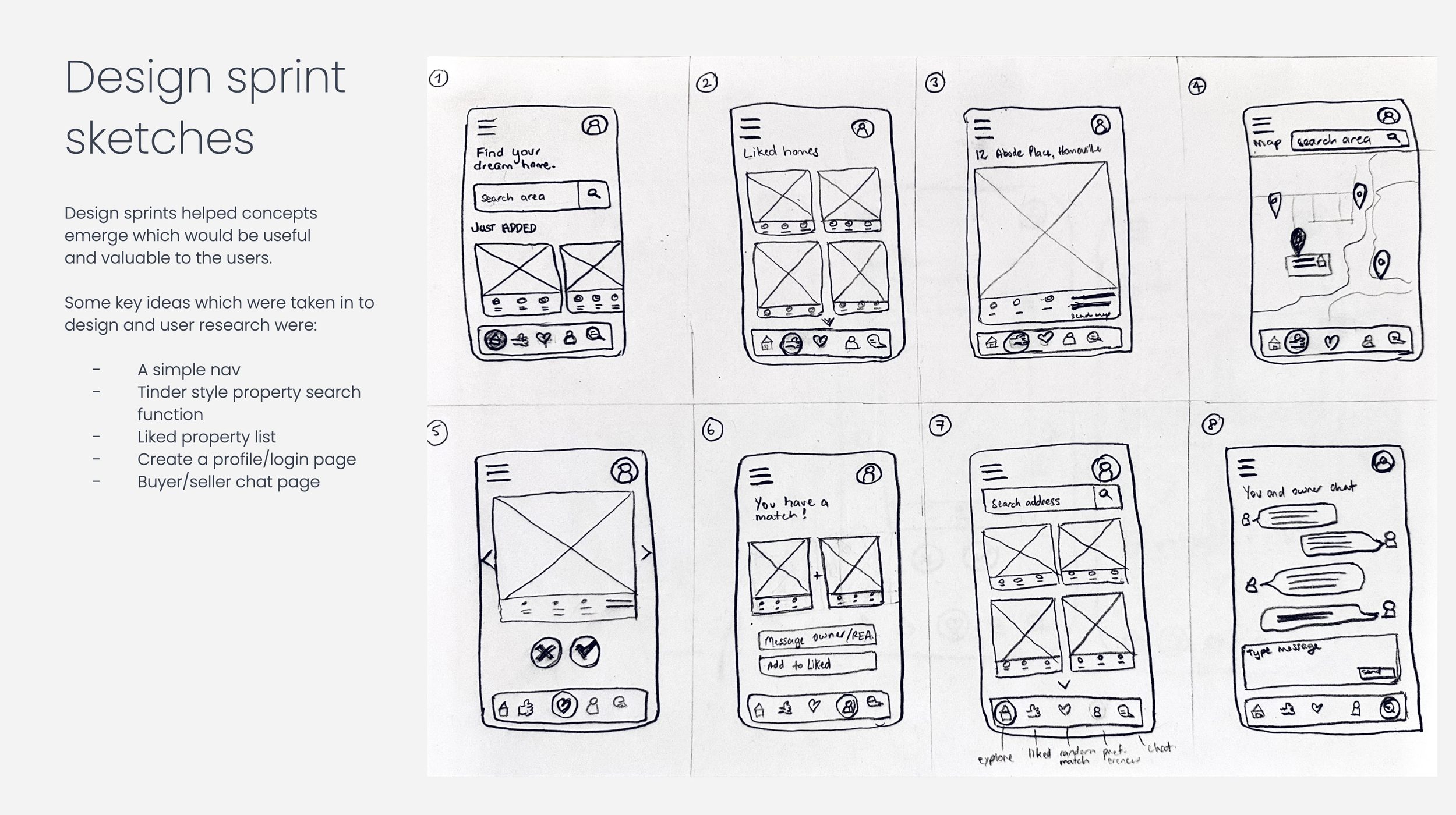
Early concepts were sketched, prioritised and developed into wireframes, with user testing helping identify what genuinely added value and what could be stripped away.
The aim wasn't to fill the product with features. It was to make an unfamiliar way of finding property feel useful, simple and intuitive.
-
Off-market property discovery was a different proposition, but the interface didn't need to feel unfamiliar.
I deliberately borrowed familiar behaviours and patterns from existing property platforms, reducing the amount users needed to learn while introducing a very different way to discover homes.
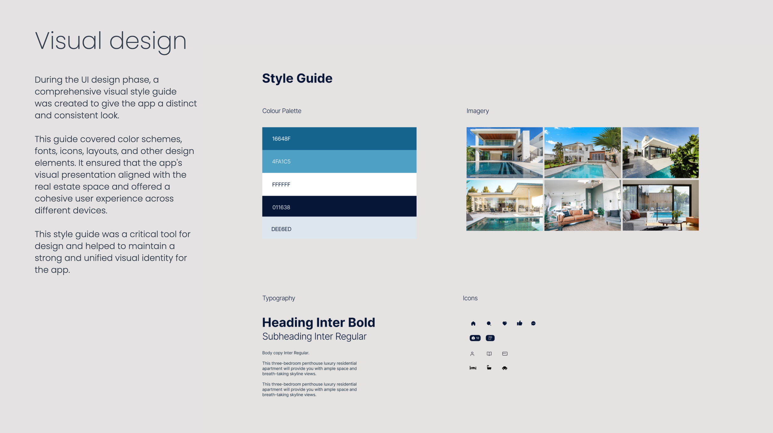
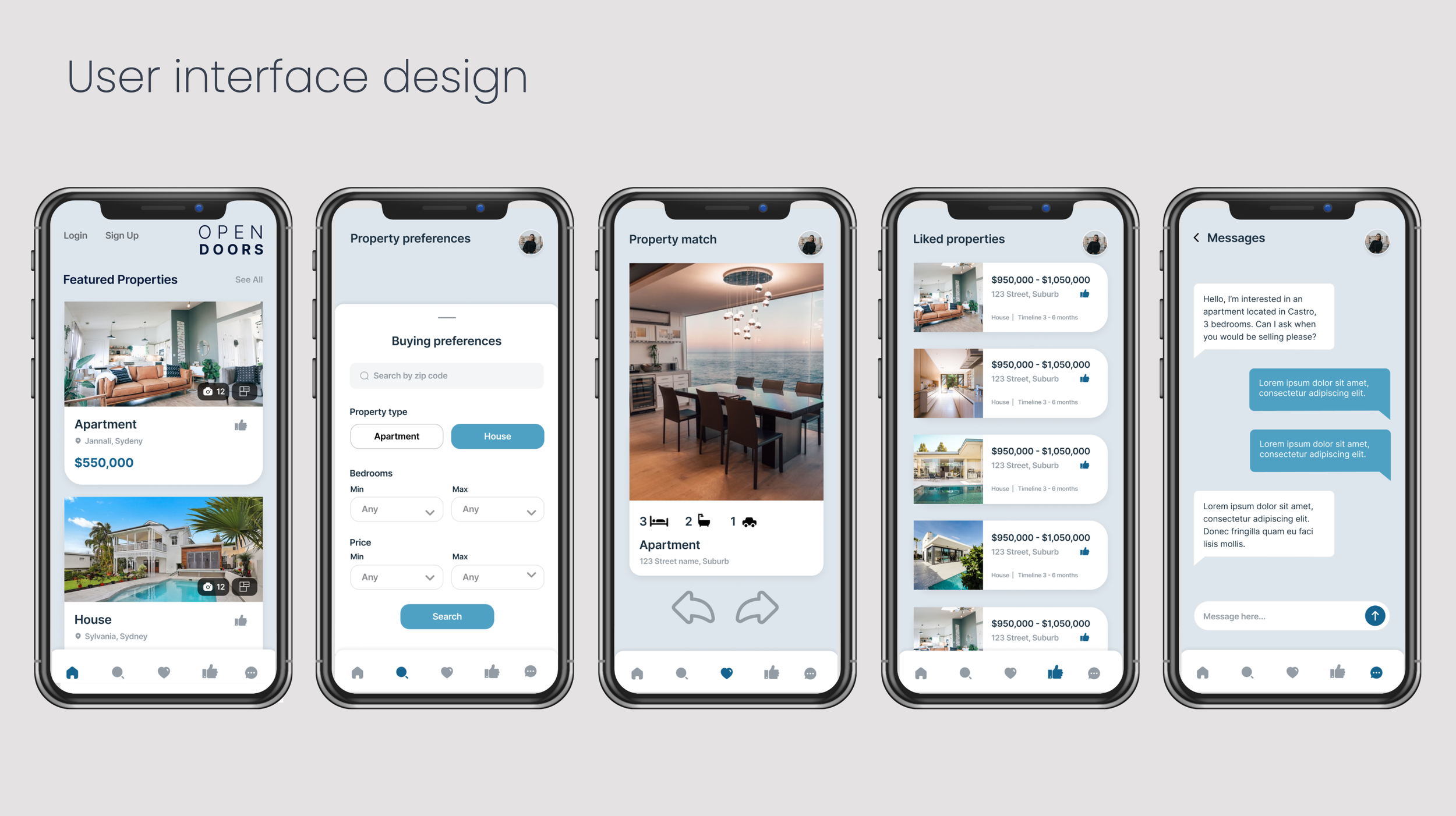
A clear visual system brought typography, colour, imagery, iconography and layout together across property discovery, preferences, matching, saved homes and direct messaging.
The final interactive Figma prototype turned the original research into an experience that felt visual, immediate and easy to browse.
A new property experience built around behaviours people already understood.
My Role
UX/UI Designer
User Research
User Interviews
Insight Development
Journey Mapping
Experience Strategy
Feature Prioritisation
Information Architecture
Wireframing
User Testing
Interaction Design
UX/UI Design
Visual Design
Interactive Prototyping
Golden >
-
End-to-end UX/UI design, from user research and insight development through to journey mapping, feature prioritisation, wireframing, visual design and interactive prototyping.
I developed the concept, product experience and visual language, testing and refining the experience around the needs of both property buyers and sellers.